As technology evolves, more and more users are embracing dark mode on their devices. Instead of the traditional dark text on a light background, dark mode uses light text on a dark background. Whether someone prefers it to reduce glare, conserve battery life, or simply for its appearance, it’s a feature that’s here to stay.
The challenge isn’t dark mode itself; it’s ensuring that the content we create remains readable and accessible regardless of how it’s viewed.
The Benefits of Dark Mode
- Reduced Eye Strain for Some Users: Especially in low-light settings, dark mode may reduce glare and screen brightness, making prolonged reading more comfortable for some individuals.
- Extended Battery Life: Black pixels use less power. That means using dark mode can help preserve battery life on mobile devices and laptops.
- Comfort for Some Visual Impairments: People who are sensitive to bright light or experience photophobia may find dark mode easier to navigate and more visually comfortable.
The Challenges of Dark Mode
- Reduced Readability for Some Users: Users with low vision or contrast sensitivity may find light text on dark backgrounds more difficult to read, particularly when color choices are not optimized.
- Inconsistent Design Across Platforms: Dark mode doesn’t always work the same way everywhere. Some apps or sites may not fully support it, leading to broken layouts, hard-to-read content, or overlooked accessibility features.
- Conflicts with Accessibility Settings: System-wide dark mode settings can sometimes override individual app or user preferences, causing confusion for users who rely on specific color settings or visual aids.
Example of Dark Mode vs. Light Mode
The example below shows the same signature in both dark mode (left) and light mode (right). The word “To:” is an image saved as a .png file with black text and a transparent background. In light mode, the signature appears clear and readable. However, in dark mode, the black text blends into the dark background, making it nearly invisible. This example illustrates why images containing text should be avoided whenever possible. Unlike live text, images cannot automatically adapt to a user’s display settings, increasing the risk that important information becomes unreadable.
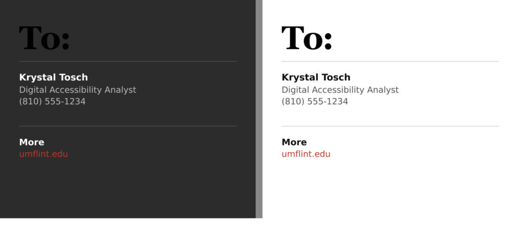
This is why it’s so important to test your content in both modes, especially when using images, graphics, or custom colors.
Best Practices
While you can’t control someone’s personal preference for Light or Dark Mode, you can make sure your content holds up in both. Here’s how:
- Use live text instead of embedding text within images whenever possible.
- Provide meaningful alt text for informative images so screen readers can convey their purpose.
- Avoid using black on transparent graphics that disappear in Dark Mode.
- Use high-contrast color combinations whenever possible.
- Test your emails in Dark Mode by turning it on in Gmail.
- (For Gmail on the web: click the gear icon > Settings > Quick settings > Theme > View all > Scroll and select “Dark Theme” – it is a black box under the Images section, next to the default theme).
Dark mode isn’t perfect, but when we design with accessibility in mind, we ensure a better experience for all users, regardless of how they choose to view your content.